 Github Stars:
 Last Commit:
  Created:
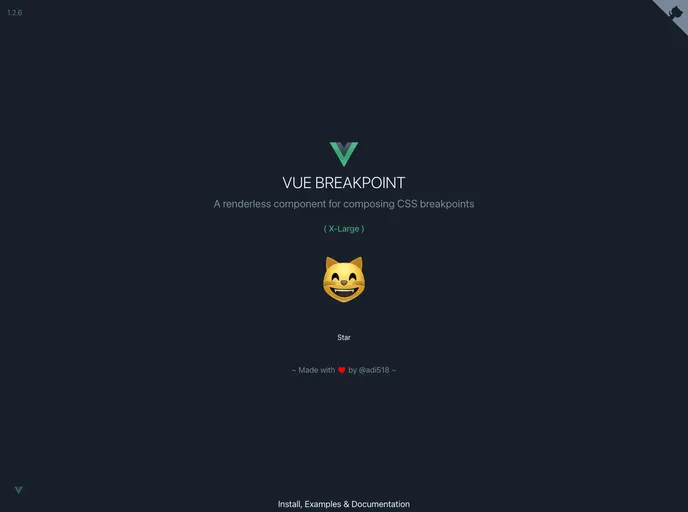
Overview
The component offers a robust solution for managing responsive designs in your templates by leveraging Vue’s capabilities. With features such as global installation, customizable breakpoints, and event handling, it significantly enhances how developers can showcase content based on screen size. Not only does it aim to prevent layout thrashing, but it also introduces experimental features that temporarily fill a gap for handling multiple root elements in Vue—a notable challenge in component architecture.
Features
Global Installation: Easily install the component globally to use three essential components, namely v-breakpoint, v-show-at, and v-hide-at, throughout your Vue application.
Multiple Root Elements (Experimental): Utilize a workaround that allows showing or hiding multiple elements, facilitating better handling of component states without following the traditional single root principle.
Custom Breakpoints: Define an unlimited number of breakpoints to suit your project needs, with default settings based on Bootstrap 4 for ease of use.
Event Emission: The component emits core events like input and change, which make handling state changes straightforward. Each event provides essential auxiliary data including viewport dimensions.
Performance Optimization: Avoid layout thrashing by leveraging the window.requestAnimationFrame, ensuring smooth rendering and responsive updates to the UI.
Flexibility with v-model: Access and manage the breakpoint state effortlessly using v-model, which integrates seamlessly into your existing template structure.
Browser Compatibility: Built on the matchMedia API for modern browsers while providing recommendations for polyfills to support older versions, ensuring broader usability.
Developer-Friendly: Rich documentation and customizable features make it accessible for both seasoned and new developers looking to enhance their responsive design workflow.


