 Github Stars:
 Last Commit:
  Created:
Overview
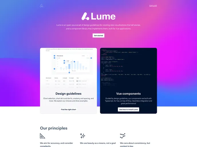
Lume is an innovative library specifically designed for creating compelling data visualizations within Vue applications. It combines a comprehensive set of design guidelines with an extensive component library, aiming to simplify the process of integrating rich visual storytelling into web applications. By supporting both Vue 2.7 and Vue 3, Lume caters to a wide range of developers while showcasing a commitment to robust data visualization principles.
The library stands out due to its focus on reactivity and SVG rendering, allowing developers to create dynamic and engaging graphics effortlessly. Its straightforward installation and development process further enhance its appeal, making it an excellent choice for anyone looking to elevate their data visualization game.
Features
Dual Vue Support: Lume ships in two distinct packages—one tailored for Vue 2.7 and another for Vue 3—ensuring compatibility and ease of use across different projects.
Robust Design Principles: Built on strong data visualization guidelines and patterns, Lume helps developers create visually attractive and informative displays of data.
SVG Rendering: Utilizes Vue’s capabilities for rendering scalable vector graphics, which is essential for high-quality visualizations that remain crisp at any size.
Comprehensive Component Library: Offers a variety of pre-built components such as bar charts and diagrams, simplifying the process of adding complex visuals to any application.
Developer Tools Integration: Incorporates modern development tools like Storybook for component showcasing and testing, allowing for efficient development workflows.
Responsive Tooltips: Integrates Popper.js for tooltip functionality, enhancing user interaction with visual elements.
Extensive Testing Framework: Supports Vitest for unit testing, ensuring the reliability and functionality of components before deployment.
Flexible Styling Options: Allows developers to import styles through CSS and Sass, providing comprehensive customization to meet design needs.


