 Github Stars:
 Last Commit:
  Created:
Overview
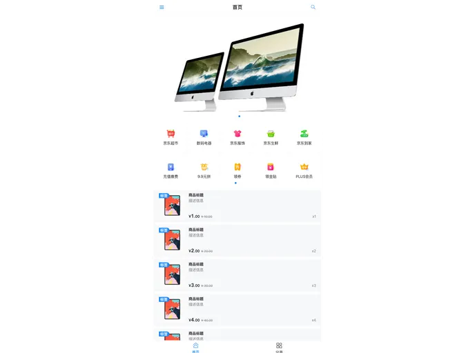
The Mobile Layout Solution is a combination of different technologies including vant3.x, vue3.x, vite2.x, ts.4.x, REM layout, and Viewport (VW) layout. It provides three layout options, including REM layout, VW layout, and a combination of REM and VW layout. The goal of these layouts is to support high-definition devices and achieve responsive design. The layouts can be implemented using the provided code snippets.
Features
- REM Layout: Utilizes dynamic font-size setting in JavaScript to adjust the size of the HTML element. CSS uses rem units and text size can be set using px. Supports 1px on high-definition devices. Provides options for setting maximum and minimum page width.
- VW Layout: Uses vw units in CSS to achieve responsive design. Text size can be set using px. Supports 1px borders, including rounded corners, on high-definition devices. Provides options for setting fixed aspect ratios for containers.
- REM + VW Layout: Combines the use of vw units for HTML font-size with rem units for CSS. Text size can be set using px. Supports 1px borders, including rounded corners, on high-definition devices. Provides options for setting fixed aspect ratios for containers. Supports setting maximum and minimum page width.
Installation
To use the Mobile Layout Solution, follow these steps:
- Install the required dependencies using yarn:
yarn install. - Use the provided code snippets to implement the desired layout:
yarn dev. - Refer to the files
./rem/scss/rem.scss,./vw/scss/vw.scss, and./vw-rem/scss/vw-rem.scssfor examples on how to call the styles in your business code. - Configure the
data-content-maxattribute in the HTML file to limit the maximum and minimum width of containers.
Summary
The Mobile Layout Solution provides three different layout options for mobile devices: REM layout, VW layout, and a combination of REM and VW layout. These layouts aim to achieve responsive design and support high-definition devices. The solution includes code snippets and examples to guide the installation and implementation process.


