 Github Stars:
 Last Commit:
  Created:
Overview
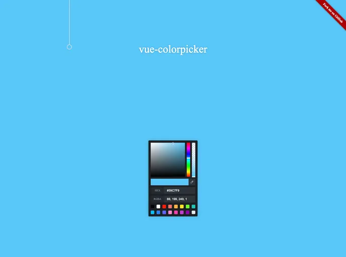
The Vue Color Picker is an elegant and highly customizable component that enhances your application with a user-friendly interface for selecting colors. Designed for flexibility, this color picker allows developers to tailor its behavior and appearance to fit the specific needs of their projects, whether you prefer a dark or light theme.
What makes the Vue Color Picker stand out is its rich feature set that caters to both casual users and serious developers. Its intuitive design not only supports various color formats but also remembers users’ color history, ensuring a seamless experience when selecting colors across different sessions.
Features
- Theme Options: Choose between a dark or light theme to seamlessly blend with your application’s design.
- Color Formats: Supports multiple color formats including RGBA and HEX to provide versatility in color selection.
- Custom Color Palette: Pre-set a default array of colors for users to select from, making the selection process faster and more efficient.
- Color History: Tracks previously selected colors, allowing users to quickly revert to their favorites.
- Event Handling: Offers a
changeColorevent that provides detailed color data, facilitating responsive updates throughout your app. - Sucker Integration: The component can open a “sucker” for more color options, requiring minimal setup with
sucker-hide,sucker-canvas, andsucker-area. - Non-Reactive Data Flow: Emphasizes one-way data flow for color changes, which simplifies the component usage and ensures clarity in event management.
- Canvas Support: Integration with HTML canvas elements allows for advanced color manipulation features and custom implementations.


