 Github Stars:
 Last Commit:
  Created:
Overview
The cherry-component project aims to provide a simple and minimalistic approach to component implementation. It emphasizes the use of only one Vue file per component and avoids introducing excessive dependencies. This allows for easy and straightforward component development without the need for a component library.
Features
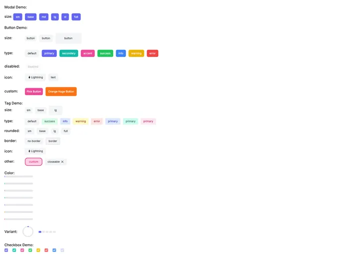
- Button: Customizable buttons to use in your application.
- Tag: Add tags to your content for organization and categorization.
- Modal: Create pop-up windows to display additional information or interact with the user.
- Progress: Display a progress bar to indicate the status of an ongoing process.
- Drawer: Implement a sliding side panel for additional content or options.
- Checkbox: Create checkboxes to allow users to select multiple options.
- Switch: Implement toggle switches for binary options.
- Alert: Display important or critical information to the user.
- Input: Create input fields to allow users to enter data.
- Select: Create dropdown menus to choose from a list of options.
- Radio: Implement radio buttons for single-option selection.
- Badge: Display numerical or status indicators for elements.
- Dropdown: Create menus that expand when clicked.
- Popover: Add custom tooltips or additional context to elements.
- Loading: Display a loading indicator to inform the user of ongoing processes.
- FileInput: Allow users to select and upload files.
- RadioCollapse: Implement collapsible sections that can be expanded or collapsed.
- Toast: Display brief notifications to the user.
- Skeleton: Create placeholder components to represent content that is loading.
- Table: Implement tables to display data in a structured manner.
- Tabs: Create tabs to organize content within a single page or section.
- Tree: Display hierarchical data in a tree-like structure.
- DynamicTags: Allow users to add and remove custom tags dynamically.
Installation
To install the cherry-component theme, you can follow these steps:
- Open your terminal and navigate to your project directory.
- Run the following command to install the cherry-component package:
npm install cherry-component
- Import the desired cherry-component in your Vue component using the following syntax:
<template>
  <div>
    <Button />
  </div>
</template>

<script>
import { Button } from 'cherry-component';

export default {
  components: {
    Button,
  },
}
</script>
- You can now use the imported cherry-component in your Vue component.
Summary
The cherry-component project focuses on simplicity and minimalism in component development. With its wide range of components, it offers flexibility and customization options while maintaining a lightweight and dependency-conscious approach. By following the installation guide, you can easily incorporate cherry-component into your Vue project and enhance your application with a variety of functional and visually appealing components.


