 Github Stars:
 Last Commit:
  Created:
Overview:
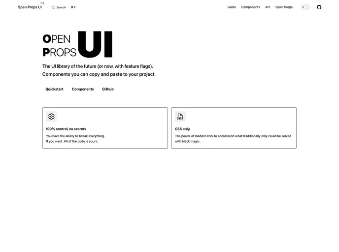
Open Props UI is an innovative CSS UI library that redefines the way we think about component creation by leveraging the latest HTML and CSS features. Designed for both professional teams and hobbyists, it focuses on ease of use and scalability, providing a fresh take on modern development practices. The library encourages users to take ownership of their components by enabling straightforward integration through simple copy-and-paste functionality, making it ideal for those looking to experiment or build fully-fledged applications.
What sets Open Props UI apart is its commitment to using cutting-edge technologies while maintaining a user-friendly approach. By starting from a blank slate, the library sidesteps the limitations that older UI libraries face, such as supporting outdated browsers, and opens the door to innovative design possibilities.
Features:
- Modern Design: Utilizes the latest HTML and CSS features to create visually appealing and functional components.
- Ease of Use: Simple copy-and-paste integration allows users to quickly add components to their projects without hassle.
- Scalability: Designed with growth in mind, making it suitable for both small projects and large applications.
- Accessibility Focused: Adheres to accessibility guidelines to ensure all users have a seamless experience.
- Flexible Defaults: Offers sensible defaults to speed up development while maintaining control for customization.
- Inspirational Components: Serves as a source of inspiration for developers, showcasing modern design practices.
- Development-Friendly: Offers documentation that acts as a testbed for the library, making it easier to learn and implement.


