Overview
The COVID-19 Data Visualizer & Interactive Timeline is a robust tool designed to keep users informed about the evolving situation of the pandemic in the UK and around the globe. Utilizing modern web technologies like Vue and Bootstrap, this applicator combines reliable data and intuitive graphics to deliver real-time insights into COVID-19 statistics.
With an emphasis on user experience, this interactive platform enables users to explore confirmed cases, regional maps, and detailed lists, making it an essential resource for both professionals and the general public eager to stay updated on the latest health data.
Features
Interactive Timeline: Users can easily navigate through timelines to visualize the progression of COVID-19 cases over time, providing a clear understanding of trends.
Data Animation: The confirmed cases feature includes a captivating bar race animation that enhances data comprehension and makes comparisons more engaging.
Regional Maps: Detailed maps are available for both countries and regions, allowing users to drill down into specific areas for localized data.
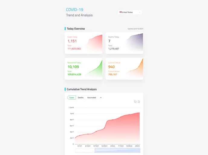
Dynamic Country Selector: A convenient dropdown menu lets users quickly switch between countries to compare statistics, making the data exploration process seamless.
Open Source Collaboration: The project is open-sourced, inviting contributions and feedback, which fosters a sense of community and continuous improvement.
Reliable Data Sources: Data is sourced from the reputable disease.sh API, ensuring that users receive accurate and up-to-date information.
User-Friendly Design: Designed with Naive-UI and ECharts, the interface is visually appealing and easy to navigate, catering to users of all technical levels.


