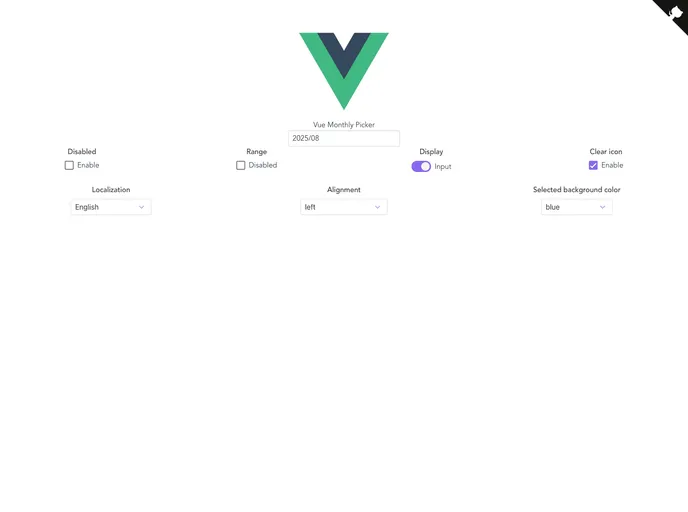
Overview
The Vue Monthly Picker is a versatile component designed for easy date selection, specifically for monthly intervals. Ideal for applications that require picking specific months and years, this component leverages the capabilities of the popular Moment.js library, ensuring users have a seamless experience when managing date inputs. Its flexibility combined with customizable features makes it a valuable addition to any Vue-based project.
Features
Custom Month Labels: Allows you to personalize the month labels by providing an array, making it suitable for different languages or formats.
Placeholder Support: Use a customizable placeholder when no value is selected, enhancing user guidance during selection.
Date Range Controls: Set minimum and maximum date limits with the
minandmaxprops, allowing you to restrict user selections efficiently.Customizable Display Format: Control how the selected month and year are presented through the
dateFormatprop, with a default ofYYYY/MM.Dynamic Background Color: The
selectedBackgroundColoroption lets you change the background color of the selected month, adding a personalized touch.Alignment Options: Align the input value according to your design needs with options for left, right, or center alignment.
Toggleable Clear Option: Users can easily clear their selection with the
clearOption, promoting a streamlined user experience.Custom Input Class: Tailor the appearance of the visible element by providing a custom CSS class through the
inputClassprop.


