 Github Stars:
 Last Commit:
  Created:
Overview
The V-Distpicker is an efficient and versatile address picker component tailored for Vue applications, making it easy to select locations down to the area level. Its capabilities cater to the needs of developers seeking to implement address selection features without the hassle of managing complex state updates. With built-in support for both desktop and mobile views, this component ensures a seamless user experience across various devices.
This component stands out for its flexibility in configuration and intuitive design, allowing users to customize the way they handle data inputs. Whether you are building a form that requires users to select their address or simply need a tool for displaying location data, V-Distpicker promises to deliver on functionality with ease of integration.
Features
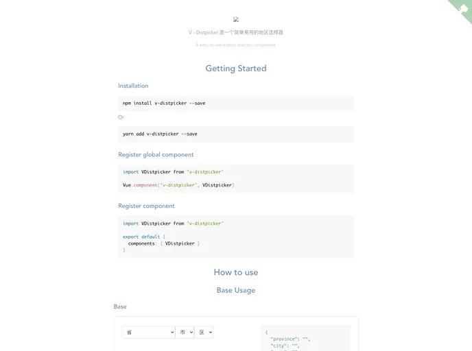
Province Selection: Easily select a province using either its code or name, offering a simple way for users to input their location.
City Selection: Similar to the province feature, this allows for city selection through encoding or naming, facilitating user navigation through their address input.
Area Selection: Users can drill down to specific areas using either area codes or names, ensuring precise location selection for accurate data input.
Custom Placeholder: Set custom placeholders for province, city, and area fields, which can enhance user experience by offering clear prompts.
Mobile Compatibility: Specifically designed to work flawlessly on mobile devices, adapting the layout for a smooth user interaction on smaller screens.
Conditional Display Options: Features like
only-provinceandhide-areaenable developers to customize the picker to show only the necessary levels, streamlining the selection process.Disabled States: Control the active state of each selection (province, city, and area) with Boolean properties, allowing for fine-tuned interactions depending on the application’s requirements.
Custom Class Names: Personalize the look and feel of the component with customizable class names for different wrapper elements, ensuring design consistency across applications.


