 Github Stars:
 Last Commit:
  Created:
Overview
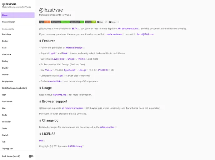
Material Components for Vue.js provides a powerful set of tools designed to help developers create beautiful and responsive web applications while adhering to Material Design principles. Currently in its BETA stage, this library is based on the Vue.js framework, allowing for seamless integration into existing projects. With its robust documentation and API reference, it’s a great option for those looking to enhance their Vue.js applications.
The library emphasizes a flexible approach to theming and customization, with support for both light and dark themes. As web development continues to evolve, tools like Material Components for Vue.js are essential for keeping up with modern design trends while ensuring functionality across various platforms.
Features
- Material Design Principles: Adheres to Material Design guidelines for an aesthetically pleasing user interface.
- Light and Dark Theme Support: Easily toggle between light and dark themes, adapting your UI to user preferences.
- Customizable Layout and Themes: Offers options to customize the layout grid, shapes, themes, and more for a unique look.
- Responsive Design: Designed with a desktop-first approach to ensure compatibility on a range of devices.
- Vue.js Compatibility: Works with Vue.js version 2.6.0 and above, along with TypeScript, Less.js (3.5.0+), and PostCSS.
- SSR Compatibility: Supports Server-Side Rendering, enhancing performance and user experience in web applications.
- Component Usage: Easy integration of components such as buttons via CDN or NPM, streamlining project setup.
- Browser Support: Compatible with all modern browsers, though some features may not work optimally in older versions.


