 Github Stars:
 Last Commit:
  Created:
Overview
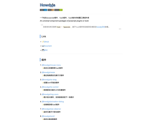
The universal component library offers a comprehensive suite of lightweight tools that include JavaScript plugins, Vue 3 components, and directives. With a solid foundation built on Vue 3 and TypeScript, it provides modern solutions for developers looking to enhance their projects. This library stands out by allowing ease of integration into both Vue 2 and Vue 3 environments, making it versatile and user-friendly.
As software development continues to evolve, this collection stands as a helpful resource for managing UI functionalities, adding features without extensive overhead. Whether you need to create a customized context menu or observe element size changes, this toolkit is designed to cater to various project needs efficiently.
Features
- Custom Right-Click Menu: The
@howdyjs/mouse-menucomponent allows developers to implement personalized context menus that enhance user interaction. - Resizable Elements: The
@howdyjs/resizeplugin enables straightforward drag-and-drop functionality for changing element sizes, providing a better visual editing experience. - Draggable DOM Elements: With the
@howdyjs/to-dragplugin, any DOM element can be made draggable, adding interactivity to your application. - Element Position Control: The
@howdyjs/to-controlplugin combines resizing and dragging for comprehensive control over element layout and positioning. - Image Zooming:
@howdyjs/img-zoomoffers a robust solution for image enlargement, allowing users to browse images in groups seamlessly. - Animated Modal Dialog: The
@howdyjs/animation-dialogcomponent features smooth animations for modals, helping create a more engaging user experience. - Size Observation: The
@howdyjs/size-observerplugin monitors changes in element dimensions, useful for responsive designs. - Custom Scrollbars: The
@howdyjs/scrollplugin provides customization options for scrollbars, enhancing aesthetics and user experience.


