 Github Stars:
 Last Commit:
  Created:
Overview
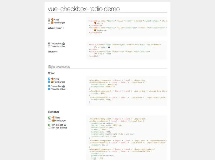
The Vue Checkbox Radio component is a versatile tool designed for developers looking to streamline the styling of checkbox and radio inputs in their applications. By providing a simple yet efficient interface, this component makes it easy to implement custom inputs without sacrificing functionality. Whether you’re building a form or enhancing user experience, this tool caters to a wide range of needs while maintaining a clean aesthetic.
This component is built with flexibility in mind, accommodating various configurations that allow developers to fully customize inputs according to project specifications. The ability to handle both checkbox and radio inputs seamlessly makes it a valuable addition to any Vue.js project, ensuring that users have an intuitive interaction with forms.
Features
Easy Installation: Quickly install the component using either npm or yarn, making integration into your project hassle-free.
Flexible Configuration: Customize attributes such as
id,class-name, andnameeasily to fit your specific use case, enhancing control over component presentation.Dynamic Data Binding: Utilize
v-modelto bind string, boolean, or array values, simplifying data management and synchronization with your application state.Custom Styling: Leverage the slot feature that allows for complete customization of input-box styling to match your design needs.
Event Emission: Both checkbox and radio components emit the input event, allowing for simple two-way data binding and updates with
v-model.Comprehensive Parameters: Offers extensive parameter options to specify behaviors including
checked,required, anddisabled, ensuring thorough configurability.Support for Multiple Values: The component can handle both individual and group selections effectively, suitable for various use cases in forms.
Open Source License: Available under the MIT license, encouraging community contributions and modifications.


