 Github Stars:
 Last Commit:
  Created:
Overview
The DialogNPMA Modal component is a versatile and user-friendly modal solution designed specifically for Vue 3.x. It offers an array of features that allow developers to easily integrate modals into their applications, enhance user interactions, and manage the visibility of dialogs effectively. By also supporting Vue 2.x with its 2.x version, this modal component ensures compatibility across different projects while retaining modern functionality.
This modal component is more than just a simple popup; it provides extensive customization options, event handling capabilities, and visually appealing layouts. Whether you need a simple alert or a complex dialog with various interactions, the DialogNPMA Modal is equipped to handle both.
Features
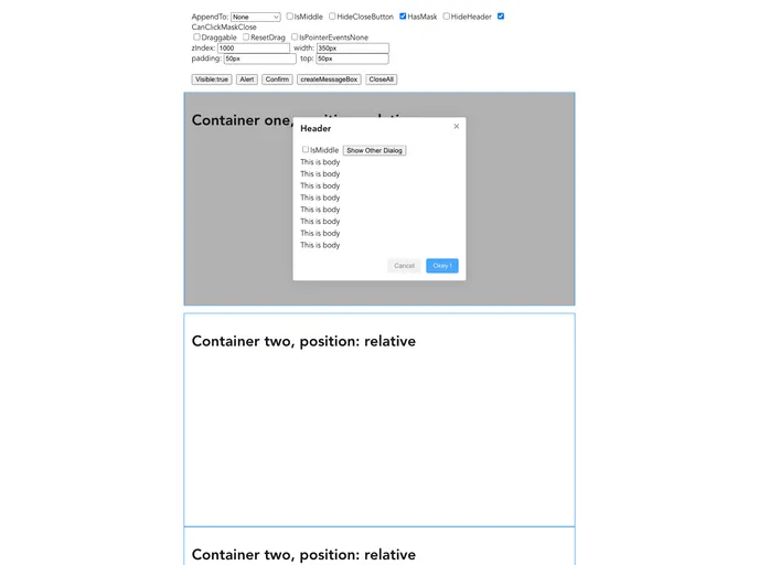
Customizable Width: Set the dialog width easily with a default of ‘400px’, making it adaptable to various screen sizes.
Dynamic Title: Use the title attribute to display customized headings, adding clarity to each dialog’s purpose.
Flexible Positioning: The
appendTooption allows the dialog to be appended to different containers, including the body or a specific ID.Draggable Support: Enable users to drag the dialog around the screen for better accessibility and improved user experience.
Control Over Header and Close Button: Options to hide the header and close button give developers more design flexibility based on UI needs.
Flexible Padding and Margin: Easily adjust the padding and top margin with default values to define the inner spacing and positioning of dialogs.
Custom Class Names: Use the
classattribute to apply custom styles and enhance the visual appeal of the modal.Event Triggers: Built-in events such as
openandcloseprovide hooks for additional functionality, allowing for callback actions during these key moments.


