 Github Stars:
 Last Commit:
  Created:
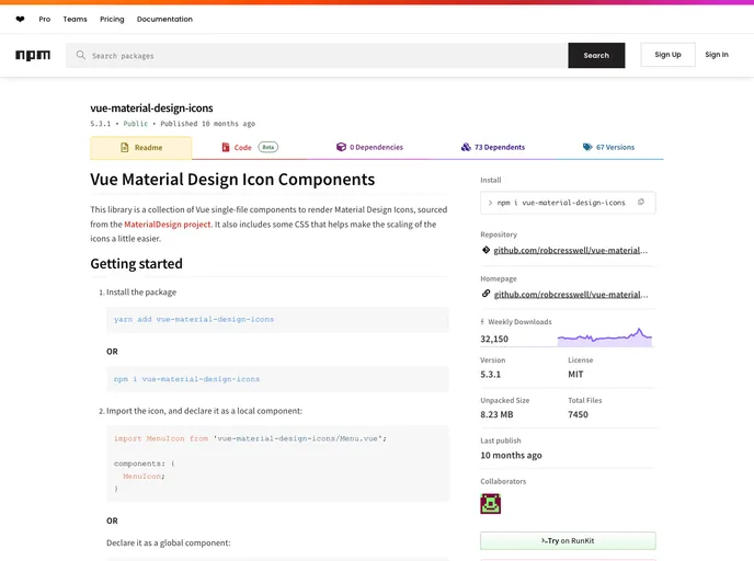
Overview
The Vue Material Design Icon Components library is a fantastic addition for developers using Vue.js who want to incorporate Material Design icons seamlessly. This collection consists of single-file components designed to make using icons straightforward while ensuring that they are visually consistent with the Material Design principles. With built-in CSS to help scale the icons to match surrounding text, this library simplifies icon integration into your Vue projects.
The setup process is user-friendly, allowing for both local and global declarations of icons. This flexibility, combined with accessibility features and customizable properties, makes it a strong choice for those looking to enhance their applications with clear and attractive iconography.
Features
- Easy Installation: Quick setup allows you to install the package or import icons directly, saving time on configuration.
- Local and Global Components: Supports both local and global declarations, making it versatile for different project structures.
- Scaling CSS: The included stylesheet enables icons to scale with surrounding text, enhancing layout consistency and responsiveness.
- Accessibility Focus: Each icon can have a title for hover tooltips and screen readers, ensuring meaningful usage and improving accessibility.
- Custom Fill Colors: The
fillColorprop allows you to modify an icon’s color programmatically, making it easy to adapt icons without diving into CSS. - Custom Sizing Options: Override dimensions with the
sizeprop, or use CSS for more tailored sizes if preferred. - Simplified Imports: Use Webpack’s resolve feature to create cleaner, more readable import statements when working with icons.
- Well-Documented Icons: A comprehensive collection of icons is available, with clear naming conventions that align with Vue Style Guide practices, making them easy to find and use.


