 Github Stars:
 Last Commit:
  Created:
Overview
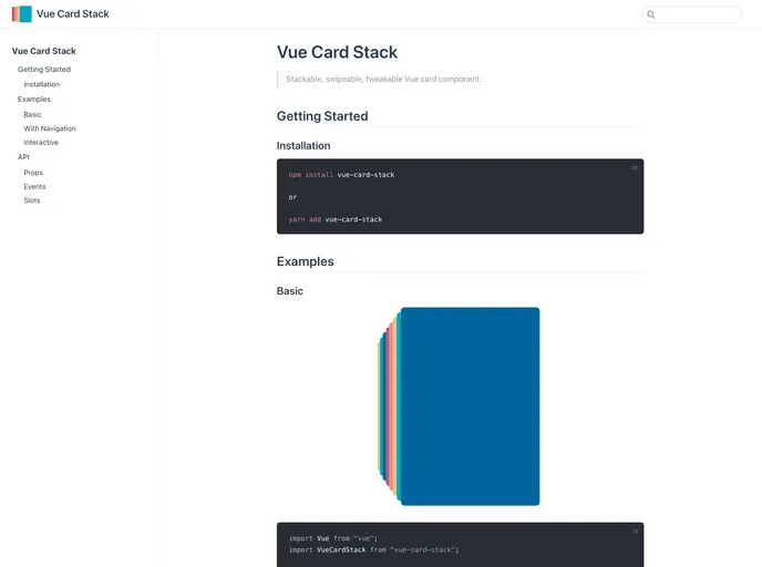
The vue-card-stack is a unique component designed for creating card stacks in Vue applications. It provides an engaging way to display a collection of items through a visually appealing card interface. Although the project is currently unmaintained, it has the potential to return in a new form, allowing developers to tap into its functionality while awaiting future updates.
With an array of customizable features, vue-card-stack allows for dynamic card presentations that can enhance user interaction. By catering to various design needs and preferences, it simplifies the process of implementing card stacks within applications.
Features
Customizable Card Dimensions: Set your preferred
cardWidthandcardHeightto suit your layout requirements, ensuring your cards fit perfectly in your design.Responsive Stack Width: The
stackWidthproperty allows you to define the width of the card stack in pixels or percentages, offering flexibility for different screen sizes.Controlled Visibility: With
maxVisibleCards, you can limit the number of cards displayed at any one time, allowing for a neat presentation that helps focus user attention.Swipe Sensitivity: Adjust the
sensitivitylevel to determine how far a card must travel before being considered for interaction, enhancing the usability of the swiping feature.Scaling Cards: The
scaleMultiplieroption lets you control the degree to which cards scale as they are swiped, creating a visually dynamic effect that captures user interest.Smooth Transitions: Define the
speedin milliseconds for your card swipe transitions, allowing for fluid user interactions that enhance overall experience.Padding Options: Control the spacing around your card stack with
paddingHorizontalandpaddingVertical, allowing you to maintain visual consistency in your layout.Flexible Card Array: Easily populate the component by providing an
Arrayof cards, with most properties being optional to ensure a quick setup.


