 Github Stars:
 Last Commit:
  Created:
Overview
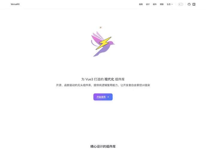
Versakit is an innovative Vue3 component library that stands out for its design and functionality. Tailored for developers who seek flexibility and customization, it provides a headless component solution that enables the creation of user interfaces without limiting the visual style. This library empowers developers to have full control over the aesthetics and behavior of their components, making it an ideal choice for modern web applications.
With over 30 high-quality components, Versakit caters to various needs, including forms, navigation, and data display. It is built on the robust Tailwind CSS framework, ensuring that while the components come with elegant defaults, they can be thoroughly customized to fit specific project requirements.
Features
- 30+ Universal Components: A comprehensive range of components designed for forms, navigation, feedback, and data display, covering various use cases.
- Tailwind CSS Integration: Built entirely on Tailwind CSS, it provides elegant default styles that can be easily adjusted for custom designs.
- Headless Mode Support: Offers an unstyled mode alongside a PT style passing mechanism, giving developers flexibility in styling components.
- On-Demand Importing: Allows for optimized application size by enabling only the necessary components to be imported.
- Theme Customization: Facilitates the creation of brand-specific UIs with support for theme changes tailored to specific projects.
- Internationalization Support: Comes with built-in language packs for Chinese and English, enhancing accessibility for diverse user bases.
- TypeScript Development: Fully developed in TypeScript, it ensures comprehensive type definitions for a better development experience.
- Dark Mode & Accessibility: Native support for dark mode with a simple toggle, alongside compliance with WCAG standards for accessibility.


