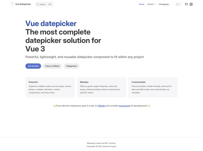
Overview
The Vue Datepicker has made its way to a new repository under the name @vuepic/vue-datepicker. This transition reflects a significant step for the development community, allowing for enhanced collaboration and accessibility. With its fresh branding, the Datepicker aims to continue providing developers with a streamlined user experience.
This Datepicker is designed to simplify date selection in applications while offering flexibility and customization options. As it becomes part of a new home, users can expect efficient updates and a robust support structure from the community backing it.
Features
- User-Friendly Interface: The Datepicker showcases an intuitive design that makes date selection easy for users of all skill levels.
- Customizable Themes: With a range of styling options, developers can adapt the Datepicker to seamlessly fit into their application’s design.
- Mobile Responsiveness: The Datepicker is fully responsive, ensuring a smooth user experience on both desktop and mobile devices.
- Locale Support: Offers support for multiple languages and regional date formats, accommodating a global audience.
- Options for Disabled Dates: Provides the functionality to disable certain dates, allowing developers to limit selections based on their specific needs.
- Single and Range Selection: Users have the flexibility to select either a single date or a range of dates tailored to their requirements.
- Framework Compatibility: Designed to integrate easily with Vue.js, ensuring compatibility with other libraries and components.


