 Github Stars:
 Last Commit:
  Created:
Overview
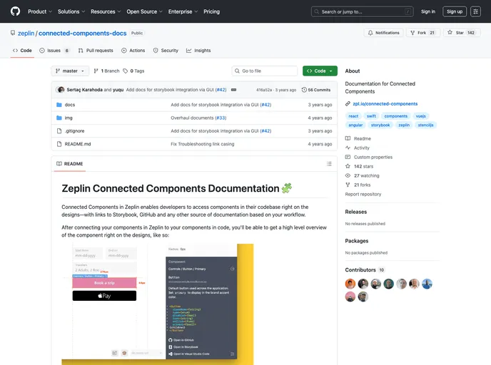
Zeplin’s Connected Components feature revolutionizes the way developers interact with design files by seamlessly integrating design components with their codebase. This functionality allows for a smoother workflow by providing direct access to essential documentation tools like Storybook and GitHub right alongside the design visuals. The ease of connecting design elements to their implementation makes it a must-have for any development team looking to enhance collaboration between designers and developers.
With a focus on modularity and extensibility, Connected Components not only supports various frameworks and platforms but also allows for the customization of links and plugins tailored to your specific work environment. It streamlines the design-to-development process, ensuring that every team member has the information they need at their fingertips.
Features
- Seamless Integration: Connect design components directly to your codebase, keeping developers informed and aligned with design intentions.
- Framework Compatibility: Supports major frameworks such as React, Angular, and Vue.js, allowing teams to use their preferred technologies without hassle.
- Documentation Links: Easily integrate links to repositories and wikis, ensuring that all necessary documentation is accessible from one place.
- Custom Plugin Support: Choose from various plugins or create your own to generate snippets and links tailored to your project’s needs.
- Local Testing: Test changes locally before pushing to production, ensuring that everything works as expected.
- User-Friendly Guides: Comprehensive quick start and manual configuration guides simplify onboarding and integration processes.
- Collaborative Tools: Enhances collaboration between designers and developers by providing a shared space with contextual information.


